Simplify. Amplify. Streamplify.
As the internet becomes our primary place to chill, chat and play, Streamplify wants to share the joy of livestreaming by making it easier to share your passion in high quality with the world.
Simplify. Amplify. Streamplify.
As the internet becomes our primary place to chill, chat and play, Streamplify wants to share the joy of livestreaming by making it easier to share your passion in high quality with the world.
BRAND PERSONA
We are the console gamer of streaming.
We are the tech friend who helps your couldn’t-care-less-about-tech friend set things up.
We are vibrant, diverse, and community-oriented.
LANGUAGE
| Down-to-earth | NOT high-brow, sophisticated |
| Straightforward | NOT complex, roundabout |
| Comprehensible | NOT term-heavy, condescending |
| Concise | NOT verbose, dumb-downed |
| Tech-light | NOT technical, spec-obsessed |
| SM-friendly | NOT lengthy, too detailed |
TONE
| Lighthearted | NOT silly |
| Playful | NOT overly sarcastic |
| Relatable | NOT try-hard |
| Casual | BUT with basic politeness |
| Serious | ONLY when talking about streaming |
| Nerdy | NOT hardcore |
The logo is monochrome and can be used against any background color with respect to the rules of background and color use.
Download Logos
The brand logo consists of the typography and the isotype.
Below are the minimum allowable sizes of the logo, by orientation. Sizes are shown in width.
Without Typography
Minimum sizes:
Print: 14mm
Digital: 42px
Vertical Orientation
Minimum sizes:
Print: 5mm
Digital: 18px

Horizontal Orientation
Minimum sizes:
Print: 23mm
Digital: 79px
Always provide sufficient contrast with the background against which the logo appears.
Please avoid crowded and restive backgrounds under the logo.
Also please keep the following in mind:

Do not change the lockup (vertical)

Do not rotate

Do not change the color
Do not change the lockup (horizontal)
Do not add outlines or other effects

Do not rearrange elements

Do not change the orientation

Do not change the color
Do not distort the aspect ratio
Do not add outlines or other effects
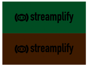
Do not place the negative logo against similarly dark backgrounds
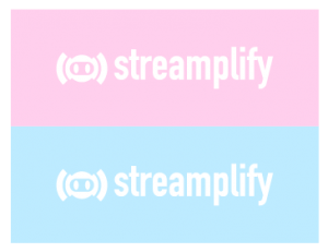
Do not place the positive logo against similarly light backgrounds
Do not use two lockups on within one design
Logo can only be in monochrome or primary colors
If the logo is placed against a light background (gray scale or white), the logo color can be changed to any color in the pallet (primary color preferred)
Primary Colors
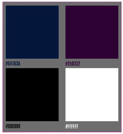
Secondary Colors
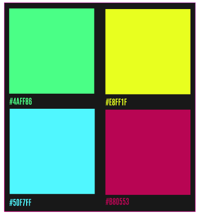
Grayscale Colors
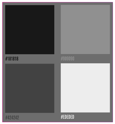
Complementary Colors
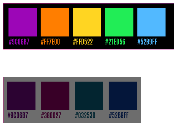
Download Color Combinations
Brand Name
The logo typography must always be written in lowercase.
In titles and body text, the brand name follows normal rules of grammar and capitalization.
Ex:
Simplify. Amplify. Streamplify.
“… its launch globally, Streamplify will expand its…
Product
1st Identifier – 2nd Identifier – 3rd Identifier
CAM – Resolution.
MIC – Sampling Rate
LIGHT – Diameter.
HUB – Design – # of ports
SCREEN – Folding Mechanism – Width
Ex:
CAM
MIC
LIGHT 14
HUB CTRL 7
SCREEN LIFT 1.5M